
In order to encourage visitors to make a buying decision, landing pages should contain every element intended for conversion. However, too many landing pages are created with a poor structure, and the success rate is not as expected.
In the following lines, we will examine some aspects that will teach us to create better landing pages that will bring better incomes.
Firstly, let’s analyze the main features associated with landing pages: heading, body, call to action, and above the fold. They work well for both generating leads and on-page actions. The following step is to analyze how to customize the landing pages in order to obtain the best results.
Begin with a Campaign Objective
When creating your landing page, you have to envision the end right before you even begin.
Here is what is very important...
- - Always create a dedicated landing page for every marketing campaign
- - Always think of a campaign goal before building a landing page
The action that you want visitors to take will be reflected by your page’s objective.
Therefore, when planning your objective, you should understand upstream traffic sources and visitor intent – to the context they came from.
In an ideal scenario, each and every inbound channel would have its own landing page since each page has different contexts.
- - The intent is associated with Search.
- - Conversation is associated with E-mail, and it can be segmented – in case you are performing marketing automation, you may have individuals in varying relationships with you when speaking about trust or the number of e-mails they have read
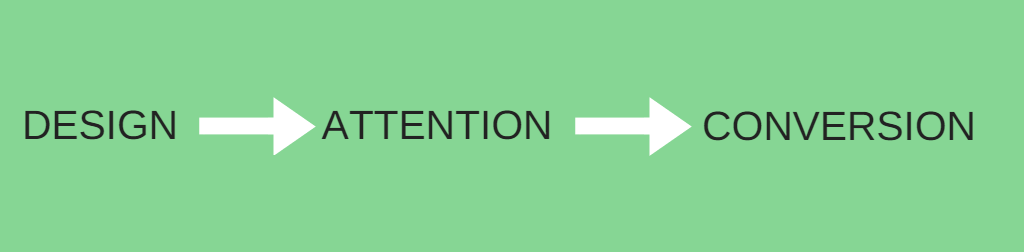
Manipulate Attention
In the online world, attention is a rare asset.
Therefore, you need to focus your visitors’ attention on what you want them to do on your landing page.
Attention ratio
There is just one objective associated with a campaign.
Therefore, there should be a perfect equality between the number of things that visitors can do on a dedicated landing page and the number of things they should do.
In case you send visitors from an ad to your home page that has several links, the equality does not exist. And this is why landing pages are so important.
Visual hierarchy
Highlight what is important on your page by using a good design. Focus on your call-to-action (CTA)!
Your CTA should be supported by your design elements, so pay attention to this aspect.
Proximity
People usually assume that there is a relation between the things that are positioned close together.
Closers are a term used to describe statements or design elements in proximity to the CTA. Closers can either persuade or deter a visitor from clicking your CTA.
As an example, people can be easily discouraged by a disclaimer, which you need to put in proximity to the button. In order to make more individuals attend your webinar and generate more leads, you can put a message like “Can’t make it? Sign up anyway and we’ll send you the recording”.
Consistency
In order to avoid adding unnecessary cognitive load on visitors, you have to represent the same type of content in the same way.
Imagine you possess testimonials throughout your long page. In case you design them the same way, each time the person comes across one, they will not have to figure out what type of content the block is.
This will increase readability.
Anomaly
On the contrary, in case something important is going to happen and you want to highlight it, make sure you differentiate it from the rest.
Imagine you are running a conference, and you have the speakers’ photos on the page. You may put them above the rest or separate them in case you want people to observe certain speakers immediately. Place the photos you want to highlight in squares in case everyone’s photos are in circles.
You will surely grab people’s attention in case you interrupt a pattern or do something unusual.
Motion
Motion combines text and graphics.
People simply can’t resist looking at movement, so this is great at grabbing attention.
In case there is nothing more down the page, you can use a scroll trigger as a motion. Make it as a bouncing arrow to point out that it is a long scrolling page.
However, you need to know that motion is dangerous in general. Therefore, if it does not support your CTA, you should remove it from your page.
Information hierarchy
You have to tell the story the right way.
The structure and layout of the landing page design can make the information look like it is out of sequence on the page.
- Copy vs. Design
It is important to know that copy should inform design. Simply because the template of your page has 3 bullet points - that does not mean that you should have the same number on the final page.
Therefore ...
- Put down the campaign copy, then
- Express that copy visually with the help of an experience.
Clear vs. Clever
Many times marketers fail to arrange the headline and sub-headline.
Even though the headline may be clever, it is really unclear. Individuals usually use the sub-headline to clarify the headline. The clarity of the page may be easily doubled by reversing the headline and sub-headline.
The context will influence the success of a clever headline.
You can rely on creativity in case you are implementing an e-mail-driven campaign. On the other hand, in case you prepare a PPC campaign, you have to make the headline match with the ad.
CTA, headline, and sub-head
There are three major things that a direct response landing page has to tell the visitor:
- The theme of the landing page? – from the headline
- What are the reasons for which I should interact with the action block? – from the sub-headline
- In case I push the button, what will I get? – CTA
Putting it all together
Meeting the visitor expectation is the main driver of conversion.
Always examine the context when creating the landing page. Make sure you deliver on what you promised before the visitors made the click. Always focus people attention on what they are supposed to do, and you will easily boost your conversion rate.
Have a look at 15 of the best landing pages examples so you know what your aiming for in your landing page designs.
Do you have any suggestions on how to improve the conversation rate of your landingpages? Please leave your comments below and don't forget to check out the best landingpage software we could find.
