
Ever since the arrival of the initial ‘Mobilegeddon’ update on 21st April 2015, mobile-friendliness has been an important factor when it comes to Google search results. In its blog post two months earlier that seemed to herald changes in the algorithm , Google pointed out that it wanted to provide better user experience by ensuring that users “find it easier to get relevant, high-quality search results that are optimized for their [mobile] devices”.
In the past couple of years, Google has reiterated and emphasized its commitment to mobile-friendliness by providing a label that is ‘mobile friendly’ which will be unique to the mobile-friendly websites such that they can be easily differentiated.
Also, changes were made to the mobile search results page which consists of user-friendly URLs and expanded site links, while also launching Accelerated Mobile Pages to provide an ultra-fast mobile experience.
Now, through this latest update, Google has increased and improved on its mobile-friendly ranking signal even further, thus making it a priority for owners of a website to ensure that the standards of Google are met in this regard.
Bearing that in mind, the question of 'how does my site meet the required standard?' becomes inevitable and has to be answered. Well, not to worry, we have come up with a simple list that can help you achieve that.
Don’t use Flash
Most mobile browsers are unable to provide Flash content, so obviously, an undeniable and important rule when creating a mobile-friendly site is: don’t use Flash. The mobile usability report from Google stylishly gives a warning that you should make use of “modern web technologies” to display your page content, animations and navigation instead. Ouch!
Make sure your viewport is set properly
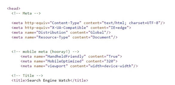
A viewport is a form of Meta tag that provides instructions as to how various page dimensions and scaling can be adjusted such that they can fit in with the width of different mobile devices. This normally appears at the top of your Webpage.
Without a viewport tag, mobile browsers will automatically revert to displaying the page at the width of a desktop screen which is not what you want if you are interested in making your site mobile-friendly. Google has a tutorial on how you can set the viewport for your page and thereby ensure that it’s accessible.
What not to do: set your viewport to a pre-defined width. Trust me; you don't want to do that. While there are some that will set the viewport to a fixed pixel width that will only be suitable for common mobile screen sizes, but not every kind of device, such are not considered by Google to be mobile-friendly.
So watch out and not do a rush job or you might end up paying for it in a way you are not prepared for.
There are instructions in Google’s tutorial which when followed while also making use of the viewport value width=device-width, will guarantee that your page matches the width of whatever device your visitors are using.
Furthermore, making use of the attribute initial-scale=1 will also allow your page to fill the screen irrespective of whether the device is portrait or landscape, thus allowing you to take advantage of the full width of the screen.
Finally, make sure that your content is properly sized to the viewport. If you happen to set absolute CSS widths for page elements like images and videos, this can bring about a problem for devices that are narrower or smaller than the already-specified width. However, you can maneuver this by making use of relative width values, such as width: 100%, in your CSS.
Use large font
If your viewport has been well configured, then font sizes will be scaled according to the user’s device, but some additional recommendations for font have been made by Google.
It recommends using a base font size of 16 pixels, with any other font sizes (such as small and large) specified in relation to that baseline. Also, the vertical space between lines should be set at 1.2em.
Furthermore, as much as possible, avoid using too many different fonts and font sizes, as these cause you to have messy and complicated page layouts.
Space out links and buttons
Links and buttons, also known as “tap targets” by Google, are harder to press on a mobile device compared to a desktop browser, due to the fact that fingers are wider and of course lack the accuracy or precision of a mouse cursor.
There are penalties in place by Google for pages with extremely small tap targets such that they are too close together to press accurately.
The average adult finger pad is about 10mm wide, so a minimum tap target size of about 7mm, or 48 pixels wide is what Google recommends and accept– at least for the most important tap targets; like frequently used buttons, navigational links, search bars and form fields.
Less frequently used targets can be smaller, but there should still be enough space between them so that the user will not make a mistake trying to press a different one. It is recommended that the space around smaller tap targets is at least 5mm.
Don’t use full-screen pop-ups
Large or full-screen pop-ups and overlays commonly referred to as “interstitials”, such as a mailing list sign-up form or app promotion, can turn out to be extra disruptive on a mobile device.
While a big, attention-grabbing pop-up might seem like a good idea from a business’ point of view, they have been deemed fit by Google that they interfere with the experience of mobile browsing and any site that uses such will be penalized.
Instead of a full-screen pop-up, it is recommended that you use a banner, or implement app indexing, which will allow content from within your app to appear in search results, making it quite an efficient method of promotion.
Run a check with Google’s tools
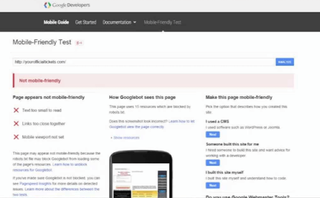
The easiest way to double-check whether your site is hitting all of the right targets for mobile-friendliness is to use the tools Google has provided to run a check.
Google’s Search Console, formerly known as Webmaster Tools, has a ‘mobile usability’ section that will determine any lingering issues with your site, usually one of the errors listed above.
You can also check the mobile health of individual WebPages by simply pasting the URL into Google’s Mobile-Friendly Test. And Google Developers has a section listing common mistakes made when designing for mobile, which has some additional detail on things like unplayable content, faulty redirects and 404s and how such can be fixed.
The need for speed
In its recommendations for working with a developer to build a mobile-friendly site (if you aren’t able to make the necessary changes to their website yourself), Google puts in a suggestion to ask your developer to “make a commitment to speed”.
Google doesn’t include a slow loading speed in particular as one of its ‘must correct’ mobile friendliness issues, but it's common knowledge that speed is a ranking factor, and statistics show that a site with a slow loading speed will regularly experience abandonment by users.
So if you want to provide the best user experience and also give your mobile-friendly site the best chance of a higher ranking, consider speeding it up as much as possible.
Google’s PageSpeed Insights has a ‘mobile’ tab which will give your page a mobile speed rating out of 100, coupled with advice on how the elements that might be slowing it down can be appropriately taken care of.
It will also give your mobile page a user experience ranking out of 100, and flag up any mobile-friendliness issues in the same way as Google’s other tools.
There’s also Accelerated Mobile Pages, Google’s ultra-fast mobile web pages which run on an updated version of HTML. Building an AMP version of your site for mobile is another way to be sure it’s fast and mobile-friendly, though many SEOs are still holding back on implementing AMP for a number of reasons. It’s an option, but not a compulsory in order to have a fast and Google-friendly mobile site.
When you do decide on creating AMP pages and your website runs on the WordPress platform there is a very useful plugin available that will make it easy for anyone to create AMP pages .
Now, if you have any ideas on optimizing your website for mobile please kindly drop your comments below.
